
Headshot photography, a crucial way for personal branding, professional portfolios, and social media profiles, demands attention to detail, especially concerning color choices. To capture the perfect headshot, choosing the right attire and considering retouching hues are essential.
But what color should you avoid for a headshot photography?
Simply avoid bright neon colors and overly saturated hues in both clothing and retouching for headshot photography. These colors can distract from the face, cause color casts on the skin, and may not render accurately in final prints or digital media.
This article offers insights and tips about color selection in headshot photography that will help ensure you make the right impression. So stay tuned and explore how the right color choices can uplift your headshots to the next level.
Headshot Photography: What You Should Know?
Capturing headshots is about showcasing your best self for professional purposes. These photos are essential for resumes, LinkedIn profiles, and business websites. They offer a glimpse into your personality and professionalism.
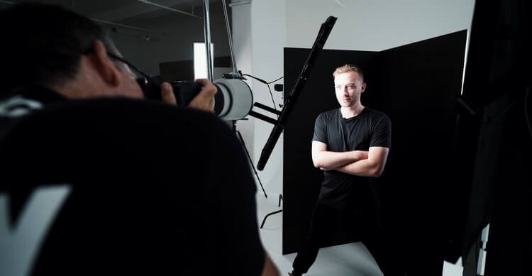
During a headshot session, the photographer focuses on capturing your unique features and expressions. It’s important to dress appropriately, choosing outfits that reflect your style and convey the right message. Avoid bold patterns or distracting accessories.
After the headshot session, the photographer may retouch the headshot photographs to enhance your natural appearance gently. This includes adjustments to lighting, color balance, and minor blemish removal. As a result, you should be presented in the best possible way without losing your authenticity.
Is Color Choice Matters in Headshot Photography?
Yes, color choice matters in headshot photography. The colors you wear and use in the background can significantly impact the final image. They can convey different emotions, set the tone, and affect how you are perceived. Here is a detailed explanation of why color choice matters in headshot photography:

First Impressions
The colors you wear can create specific emotions and perceptions, influencing how viewers interpret your character and professionalism. Vibrant hues convey energy and confidence, while muted tones suggest sophistication and reliability.
Attention and Focus
The focus of your headshot should be your face, so avoid making your headshot too busy or bold with bold colors. Opting for solid colors or subtle patterns ensures attention remains on facial expressions and features, enhancing the photograph’s effectiveness.
Skin Tone Harmony
You can appear vibrant or washed out in a photograph depending on whether you choose colors that complement or clash with your skin tone. When you choose colors that compliment your complexion, your image will look more flattering and natural.
Background Harmony
The background color sets the mood and atmosphere of the photograph, influencing its overall aesthetic appeal. Selecting a background color that complements your attire and skin tone creates visual harmony and enhances image cohesiveness.
Visual Consistency
The use of consistent color throughout the composition, including clothing, the background, and editing, ensures the headshot’s professionalism and visual coherence. The image will appear polished and well-designed when you use harmonious colors, which will reflect positively on your personal brand or professional image.
By carefully selecting colors that align with your personality, skin tone, and intended message, you can create headshots that effectively represent you. This will convey the desired image to your audience.
What Color Should You Avoid for a Headshot Photography?
The choice of color is crucial when it comes to headshot photography. You can enhance your features with the right colors, while you can distract yourself with the wrong ones. The following colors should be avoided for best headshots:
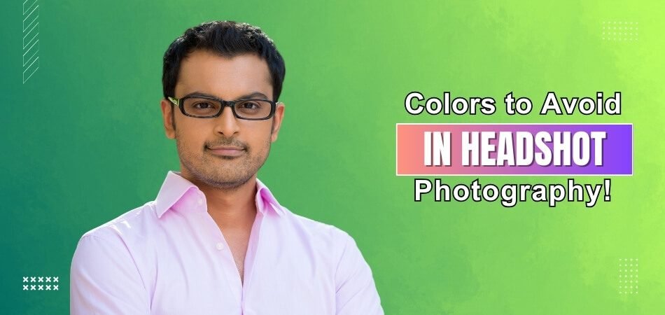
Bright Neon Colors
Neon colors can be too intense and distracting in a headshot. They can overpower your facial features and draw attention away from your eyes and expression. Opt for softer, more subdued shades that complement your skin tone and convey a professional image.
Overly Saturated Hues
Overly saturated colors can cause color casts on your skin, making it look unnatural in the final photo. It’s advisable to stick to muted tones that flatter your skin tone. Consider how the color will appear in different lighting conditions, both during the photoshoot and in the final image.
Avoid Clashing Colors
Colors that clash with each other or with the background can create visual confusion in your headshot. It’s important to choose colors that harmonize well together for a cohesive look. Consider the color of your background and clothing to ensure they complement each other and enhance your overall appearance.
Consider Your Skin Tone
Colors can wash out or exaggerate your skin tone in a photo. It’s advisable to avoid colors that make your skin look dull or too bright. Opt for colors that enhance your natural complexion and make you look vibrant and healthy.
Avoid Trendy Colors
The latest trendy colors may be tempting for your headshot, but they may not last. Consider classic, timeless colors that will remain fashionable for years to come. Neutral colors like navy, gray, and burgundy are safe choices that never go out of style.
Think About Editing
Bright or neon colors can be challenging to edit, as they cause color shifts and inconsistencies. It’s easier to work with more subtle, natural colors in post-production. Consider how your clothing color will affect the editing process and choose accordingly.
Common Challenges in Color Selection for Headshot Photography
The colors you choose for headshot photography are crucial, as they can positively influence the overall image. Here are some common challenges you may face when choosing colors for your headshot:
- Skin Tone Compatibility: Finding colors that complement various skin tones can be challenging but crucial for a flattering result. Consider consulting a color wheel to identify complementary or analogous colors that enhance your skin tone.
- Background Coordination: Coordinating clothing colors with the background without causing distractions requires careful consideration. Opt for neutral backgrounds or colors that complement your outfit without overpowering it.
- Color Psychology: Knowing how colors convey messages and emotions adds complexity to the selection process. Choose colors that align with your brand or the message you want to convey in your headshot.
- Avoiding Color Clashes: Ensuring colors don’t clash with each other or with the background maintains visual harmony. Avoid combining colors that are too similar or too contrasting, as they can create a jarring effect in the final image.
- Print vs. Digital Considerations: Colors may appear differently in print and digital media, requiring adjustments for consistency. Test your selected colors in both formats to ensure they appear as intended in different mediums.
- Editing Challenges: Bright or neon colors can cause color casts and complicate the editing process, demanding extra care. Opt for softer, more natural tones that are easier to edit and enhance your features without overpowering them.
Despite these challenges, thoughtful color selection can boost your headshot, enhancing your professional image and personal brand. Take your time to experiment with different colors and combinations to find the perfect look for your headshot.
How Can Headshot Retouching Services Correct and Improve Colors?
Professional headshot retouching services can elevate your photos, rendering them with a polished and refined appearance. They adeptly adjust colors to guarantee that your headshot shines, showcasing your best features.
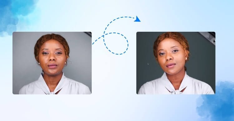
By skillfully enhancing hues and tones, retouchers breathe life into your images, exemplifying their expertise in headshot retouching. The following are some methods for correcting color:
Balancing White Balance
White balance sets the mood of your headshot. Retouching services adjust it to avoid unnatural skin tones. The goal is to achieve a natural, lifelike color balance. This correction provides a solid foundation for further enhancements.
Enhancing Skin Tones
Skin tones are crucial in headshots. Retouchers fine-tune them to look healthy and vibrant. They ensure the skin looks natural, not overly processed. This step is vital for a professional and appealing appearance.
Adjusting Saturation
Saturation adds depth to your headshot. Retouching services tweak it for vivid, yet believable colors. They ensure the colors are neither too dull nor too intense. The result is a headshot that stands out for the right reasons.
Correcting Color Casts
Unwanted color casts can ruin a headshot. Retouchers identify and neutralize these tints. They ensure the colors in the photo are true to life. This step is essential for maintaining color accuracy.
Fine-Tuning Contrast
Contrast adds dimension to your headshot. Retouching services adjust it to enhance facial features. They strike a balance to avoid flat or overly harsh images. Proper contrast makes the headshot more dynamic and engaging.
Custom Color Grading
Color grading gives your headshot a unique feel. Retouchers can apply a specific color tone to match your brand. This step adds a creative touch to your headshot. It helps your photo align with your personal or professional identity.
Frequently Asked Questions about What Color Should You Avoid for a Headshot?
Here are some of the FAQs and their relevant answers for a clear concept of what color should you avoid for a headshot:
Can I Wear Neon or Fluorescent Colors for a Headshot?
It’s generally best to avoid neon or fluorescent colors as they can be distracting and may not translate well in different lighting conditions.
Should I Steer Clear of Wearing All-white Clothing for My Headshot?
Yes, all-white clothing can sometimes wash out your complexion in photos, so it’s advisable to choose softer or more neutral tones instead.
Is It Okay to Wear Black for a Headshot?
While black can be sleek and sophisticated, it’s often advised to opt for darker shades like charcoal or navy to avoid a harsh contrast against your skin tone.
Can I Wear Bold Patterns or Prints for a Headshot?
It’s generally best to avoid busy patterns or prints as they can be distracting and take away from the focus on your face. Solid colors tend to work best.
Should I Avoid Wearing Red for My Headshot?
Red can sometimes be overpowering in photos and may draw too much attention away from your face. Opting for softer shades like burgundy or rose can be more flattering.
Is It Advisable to Wear Metallic or Shiny Fabrics for a Headshot?
Shiny fabrics or metallics can create glare and reflections in photos, which can be distracting. It’s usually best to stick to matte textures.
Should I Avoid Wearing Colors That Match My Background Too Closely?
Yes, wearing colors that blend too closely with your background can make you appear as if you’re floating in the photo. It’s better to choose contrasting colors for better visibility.
Can I Wear Very Dark Colors for a Headshot?
While darker colors can be flattering, it’s important to ensure there’s enough contrast between your clothing and background to avoid appearing too somber or blending into the background.
Bottom Line
The choice of color is one of the most important considerations when photographing a headshot. Choosing the right colors for your headshot can help you enhance your professional image.
In particular, it’s important to know “What color should you avoid for a headshot photography?” to avoid common pitfalls. Colors with neon shades and overly saturated hues can distract from your facial features and cause unflattering color casts.
A headshot can be elevated to the next level when colors complement your skin tone and convey the right message. Making the right color choices can have a significant impact on how others perceive you.